Pop & Go
Brand identity, packaging and D2C website for Pop & Go, India’s first creatine chews. The shaker cup is dead.

01 — Context
Pop & Go, a brand by MSHIELD Supplements, set out to take creatine out of the shaker cup. Its first product, Creava, packs micronized creatine monohydrate into a tangy Mango Shock chew: no powder, no water, no mess.
We were brought in before launch to build the whole brand: name lockups, identity, packaging and the online store.
02 — The challenge
Supplements in India look alike: black tubs, chrome type, aggressive gym imagery. Pop & Go’s customer is someone who trains but also has a desk job, a commute and a life. The brand had to feel as easy as the product, while still being trusted as a real supplement.
On the shelf and on a phone screen, Creava had to read as candy-level fun with supplement-level credibility.
03 — Identity
The Pop & Go wordmark is hand-drawn: a quick, signature-like script with a motion arrow, built to feel like grabbing something on your way out. It sits against a confident grotesk for headlines, so the brand can shout “The shaker cup is dead” and still look clean.
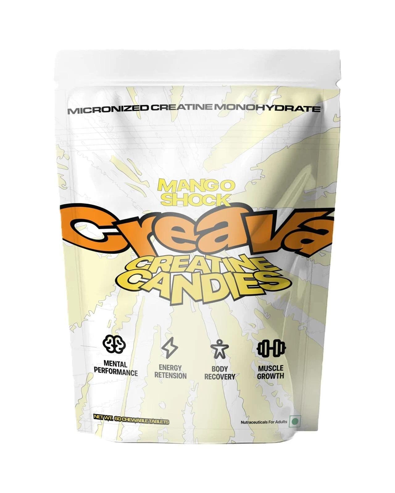
Creava, the product brand, gets its own loud, inflated logotype in mango orange and yellow, with a tagline lockup “Creatine Candies” set like a sweets wrapper.
04 — Packaging
We designed a matte stand-up pouch that feels closer to a confectionery bag than a protein tub. The front carries four benefit icons (Mental Performance, Energy Retention, Body Recovery, Muscle Growth), drawn as a custom line set, plus “Micronized Creatine Monohydrate” across the top so the product is never mistaken for candy.
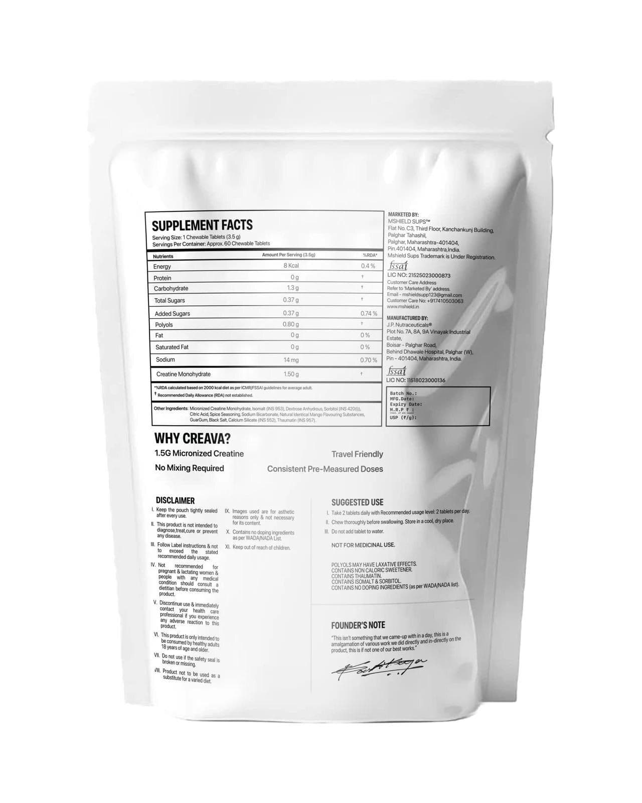
The back panel holds the supplement facts, dosing, “Why Creava?” reasons, disclaimers and a signed founder’s note, arranged so compliance copy stays legible without crowding the brand.
05 — Website
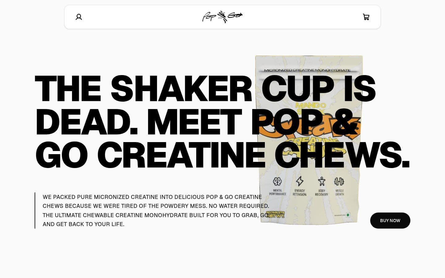
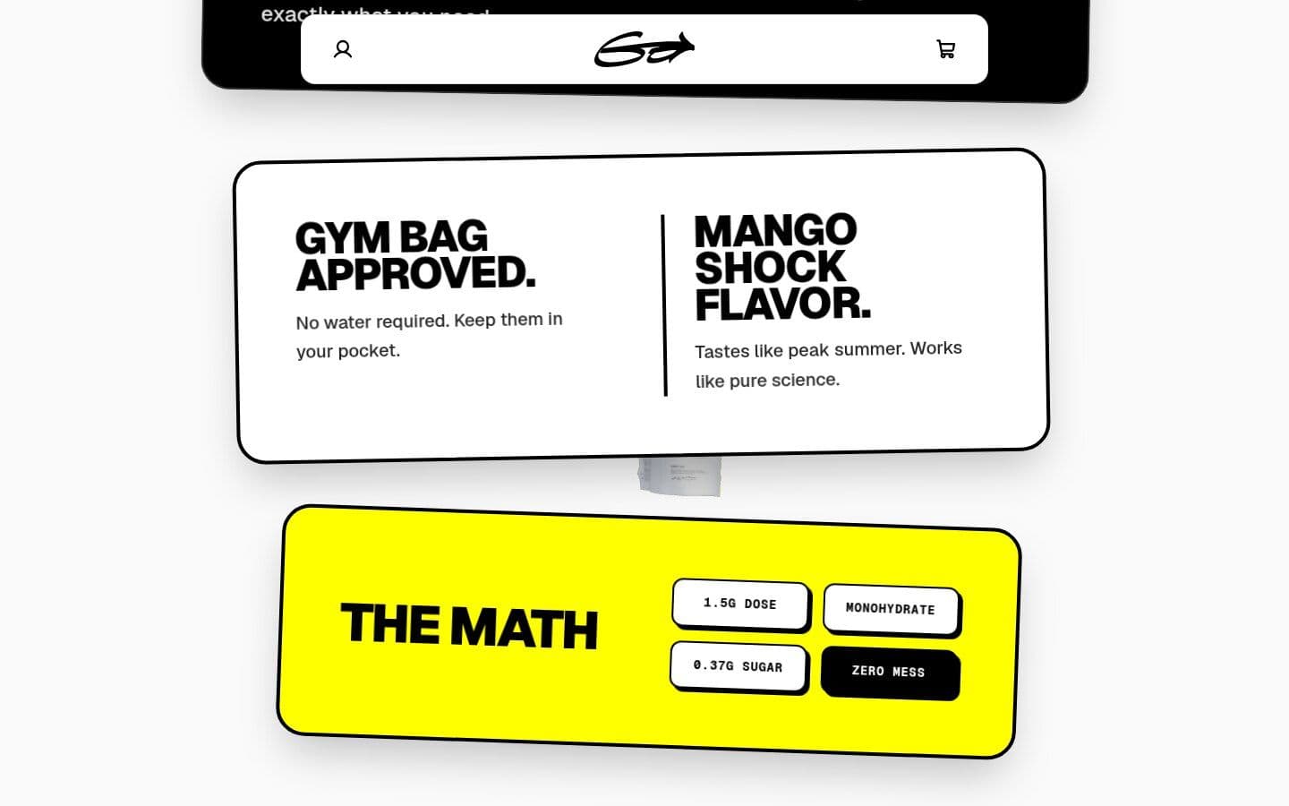
The storefront opens on the line that sums up the brand: “The shaker cup is dead. Meet Pop & Go creatine chews.” Oversized type runs straight into the pouch, so the product is the hero from the first frame.
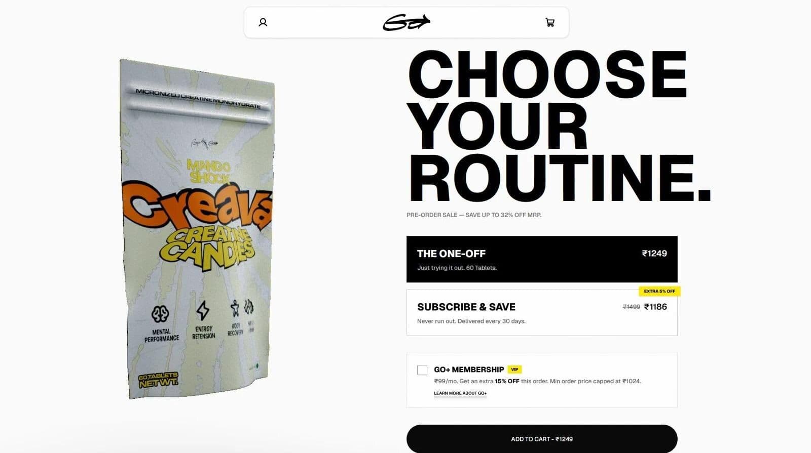
Below it, autoplaying vertical videos show the chews in real life, and the buying module is built for repeat purchase: a one-off pack, Subscribe & Save, and a Go+ membership that adds a further discount, all on one screen.

06 — Build
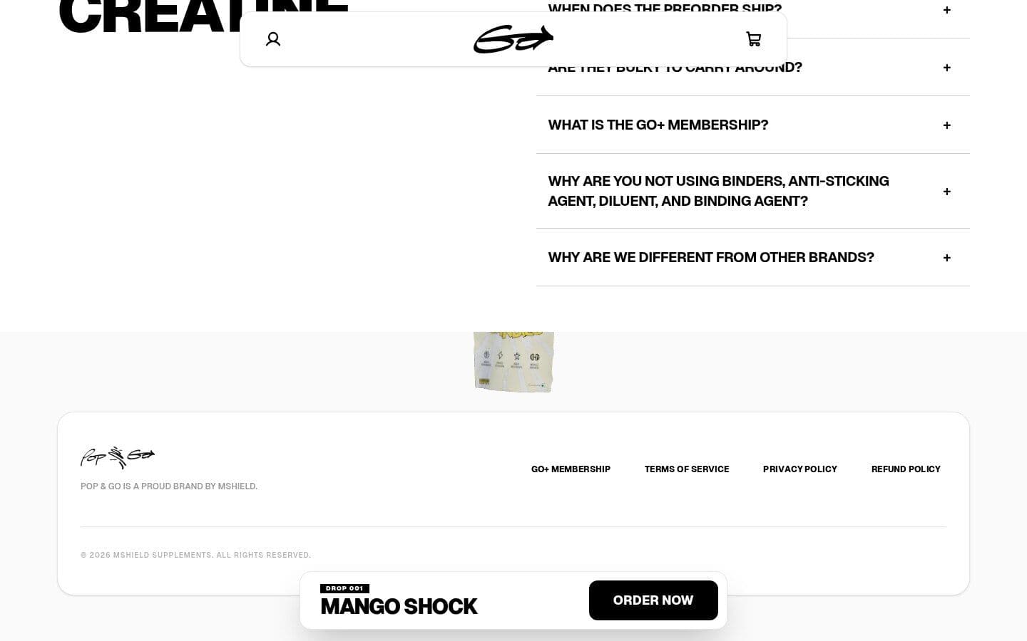
The site is a fast custom front end with content managed in Sanity and checkout, inventory and subscriptions running on Shopify, so the team can edit copy and drops without touching code. A dedicated membership page explains Go+ and its savings.
07 — The result
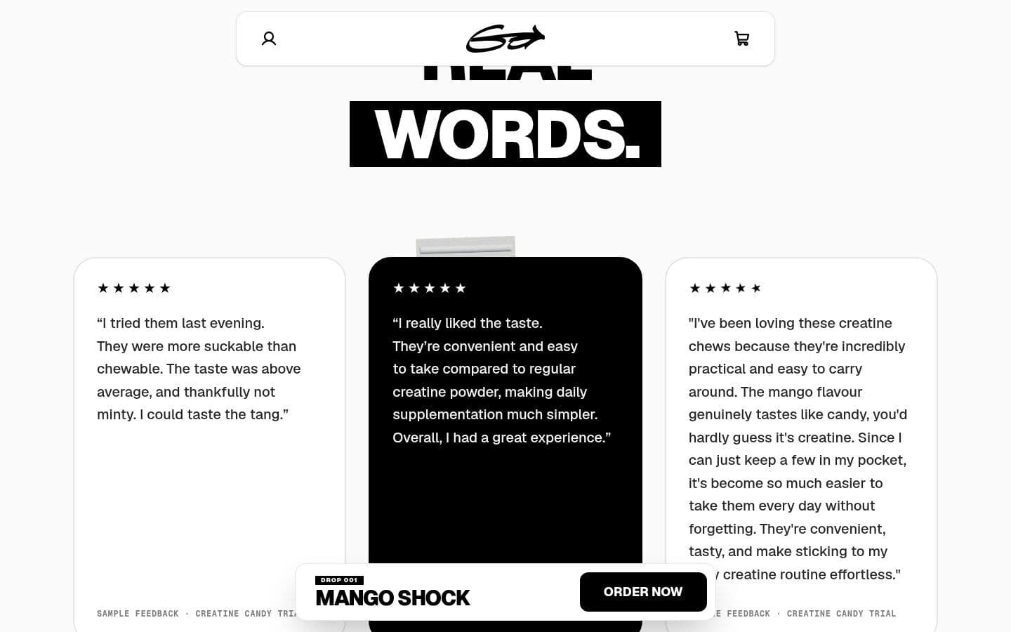
One coherent brand from pouch to checkout: a product that looks like a treat, reads like a supplement, and sells like a subscription. The identity and pouch system are built to extend to new flavours and products under the Pop & Go name.
Credits
Client: Pop & Go by MSHIELD Supplements
Brand identity, packaging & website: Diyuksh Rajpurohit